
Your mobile site’s speed and responsiveness aren’t just technical concerns—they’re business-critical.
With mobile devices now accounting for over 50% of global web traffic, a sluggish or unstable mobile experience can drag down SEO rankings, tank conversions, and frustrate users before they ever engage with your content.
- Ask yourself: how often do you stick around for a slow-loading mobile site?
Probably never—and your audience feels the same.
In this guide, we’ll break down the key strategies you need to elevate your mobile site’s performance and meet modern user expectations.
Here’s what you’ll learn:
Let’s dig into the strategies that will help you deliver a faster, smoother mobile experience—one that supports both your users and your bottom line...
Understand Mobile User Expectations
When it comes to mobile browsing, user expectations are sky-high.
Your visitors are looking for a fast, fluid, and frustration-free experience every time they visit your site.
Let's break down what that means in terms of specific performance metrics that you should be aiming for:
- Speed—mobile users expect lightning-fast load times. Recent studies suggest that 53% of mobile site visits are abandoned if pages take longer than three seconds to load.
- Interactivity—this refers to how quickly a page becomes interactive. Users want to be able to click, scroll, and interact with your site without delay.
- Stability—ever had the text or content shift around while you're trying to read or click? that's poor visual stability, and it's a surefire way to frustrate users and drive them away.
📏 Key Metrics to Know
To cater to these expectations, Google has developed specific metrics to help you measure how well your site stacks up:
Largest Contentful Paint (LCP)
This measures the time it takes for the largest content element on your page to load.
Aim for an LCP of 2.5 seconds or faster.
First Input Delay (FID)
This measures the time from when a user first interacts with your site to the time when the browser is actually able to respond to that interaction.
A good target is less than 100 milliseconds.
Cumulative Layout Shift (CLS)
This measures the stability of your content as it loads.
To provide a good user experience, strive for a CLS score of less than 0.1.
These metrics are part of Google's Core Web Vitals, a subset of factors that Google considers important in a webpage's overall user experience and which influence its ranking in search results.
By optimizing these key aspects, you ensure that your mobile site meets user expectations, enhancing their experience and boosting your site’s performance in search engine results pages (SERPs).
Remember, a happy visitor is more likely to convert into a customer, so these improvements can directly impact your bottom line. 📈
Now let's look at the 5 key steps you need to improve mobile site performance, starting with assessing how things stand right now...
1. Assess Your Current Mobile Site Performance
Before you can improve your mobile site, you need to understand how it’s performing today.
A thorough assessment reveals where to focus your optimization efforts.
Here are the key tools to use—each offering a unique perspective:
🔍 Google PageSpeed Insights
Enter your URL and get a mobile performance score out of 100, along with actionable suggestions.

Aim for a score of 90+ for strong mobile performance.
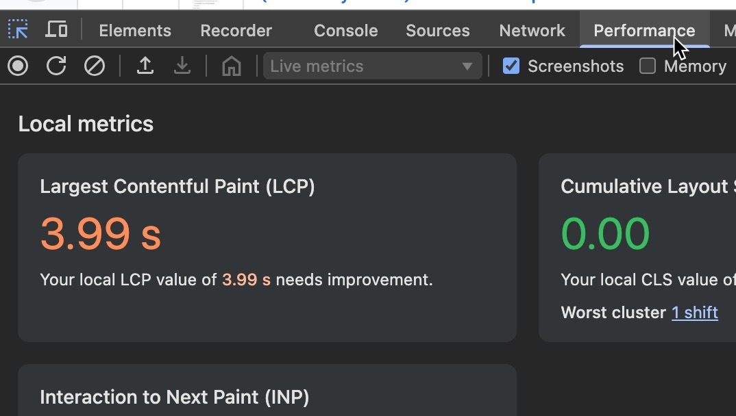
🧪 Google Lighthouse
For a deeper audit, use Lighthouse via Chrome DevTools.
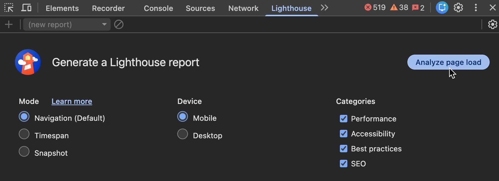
It evaluates performance, accessibility, SEO, and more—highlighting Core Web Vitals like LCP, FID, and CLS.
You can also see stats via the Performance tab.
Run multiple tests and average the results for consistency..
👥 Real User Monitoring (RUM)
Go beyond lab tests with RUM tools like Google Analytics or New Relic.
These track real-world user behavior and help you prioritize issues that truly impact your audience.
✓ Run PageSpeed Insights for a quick performance snapshot.
✓ Use Lighthouse for a full audit of key metrics.
✓ Incorporate RUM to understand how real users experience your site.
By combining these tools, you’ll build a well-rounded view of your mobile site’s strengths and weaknesses—setting the foundation for strategic improvements that drive results.
Mobile users expect lightning‑fast load times, instant interactivity, and stable visual layout. When your site falters, their patience disappears—and conversions vanish with it.Click To Post On
In the next section, we'll delve into specific optimization strategies that can help you enhance your site's load times...
2. Implement Optimization Strategies for Faster Load Times
Now that you've assessed your mobile site's current performance, it's time to kick things into high gear.
Let's dive into specific strategies to decrease load times and boost your site's speed. 🚀
These tweaks can make a significant difference in how quickly your content reaches your users, enhancing their experience and your site's SEO performance.
Optimize Images and Videos
Leverage Browser Caching
Start by setting an expiration date or a maximum age in the HTTP headers for static resources.
This instructs the browser to load previously downloaded resources from local disk rather than over the network.
Also make sure to utilize cache-control headers to define how, and for how long, individual resources are cached by browsers and proxies.
Reduce Server Response Times
Minify CSS, JavaScript, and HTML
Remove unnecessary spaces, comments, and characters.
Tools like UglifyJS, CSSNano, or HTMLMinifier can automate this process.
Where possible, combine multiple CSS or JS files into single files to reduce HTTP requests.
Each of these optimizations contributes to reducing the amount of data that travels between the server and your users, which speeds up your site's load times significantly.
Optimize Critical Rendering Path
- Prioritize above-the-fold content—use critical CSS (style sheets) to style elements displayed immediately on page load and defer the rest.
- Asynchronous loading for JavaScript—modify the way scripts are loaded by making them asynchronous so they do not block the rendering of the page.
While implementing these strategies, regularly monitor the impact on your site's performance through tools like PageSpeed Insights.
This will help you understand which optimizations are most effective and how they improve your site's load times.
By applying these targeted strategies, you are not just enhancing the user experience but also strengthening your mobile site's competitiveness in search engine rankings.
3. Enhance User Interactivity and Visual Stability
Optimizing for speed is crucial, but it's only part of the puzzle.
Enhancing user interactivity and ensuring visual stability are equally vital to keep users engaged and reduce bounce rates.
Here’s how you can refine these aspects:
Optimize JavaScript Execution
defer attribute in your HTML script tags for JavaScript files that aren't critical to the initial page load. This prevents them from blocking the rendering of the page.
Use Chrome DevTools to profile JavaScript execution and pinpoint functions that are slowing down your page.
Improve Visual Stability
<img> tags. This prevents the browser from re-calculating the layout as images load, which can cause content to shift unexpectedly.
font-display: swap; in your CSS to control how fonts display. This prevents the flash of unstyled or invisible text as fonts load.
Cumulative Layout Shift (CLS) is a key metric for visual stability.
By addressing the points above, you can improve your CLS score significantly, leading to a smoother experience for your users.
Enhance User Interactivity
Regularly test your mobile site’s interactivity and visual stability using real devices.
Tools like BrowserStack or real device testing on Chrome DevTools can simulate different scenarios and help you fine-tune user experiences.
By focusing on these strategies, you not only boost usability but also foster positive perceptions of your brand, keeping users coming back.
Ready to enhance your site's interactivity and visual stability?
Implement these tips, and watch user engagement soar! 🚀
4. Implement Responsive Design for Mobile Users
Responsive design isn't just a trend; it's an essential part of creating a successful mobile user experience.
By implementing a responsive design, your website adapts seamlessly to different screen sizes and devices, ensuring every user enjoys a high-quality experience.
Here’s how you can optimize your mobile site with responsive design:
Use Flexible Grids
max-width: 100%; and height: auto; to keep images scalable.
Implement Media Queries
You might want larger, higher-quality images on desktop but smaller, optimized images on mobile.
Test your media queries on actual devices and not just browser simulators. Real device testing can reveal nuances that simulators might miss.
Optimize Text for Readability
Ensure that text size adjusts according to the device so it remains legible.
A font that’s easy to read on a desktop might be too small on a mobile device.
In addition, keep line lengths short.
Opt for 60-70 characters per line for optimal readability on mobile devices.
Consider Touchscreen Usability
Mobile users often navigate with one hand.
Design your website’s navigation to be easily usable with one-thumb actions, enhancing accessibility and user satisfaction.
Test Responsive Design Thoroughly
<meta name="viewport" content="width=device-width, initial-scale=1"> tag in your HTML. This tells the browser how to control the page's dimensions and scaling.
Implementing responsive design not only enhances user experience but also contributes to increased engagement and conversion rates.
By ensuring your site is accessible and attractive across all devices, you position your brand as modern and user-friendly.
5. Regularly Monitor and Update
Ensuring that your mobile site remains fast, responsive, and user-friendly isn't a one-time task—it requires ongoing vigilance and adaptation.
Regular monitoring and updating are crucial to keep pace with evolving user expectations, technological advancements, and search engine algorithms.
Here’s how you can effectively maintain your mobile site’s performance over time:
Schedule Regular Audits
Set a regular schedule to audit your mobile site's performance using tools like Google's PageSpeed Insights and Lighthouse.
Depending on your site’s traffic and updates, consider conducting an audit monthly or quarterly.
Create a standardized checklist for each audit to ensure you consistently check for the same optimizations and issues, such as load times, user interactivity metrics, and visual stability.
Automate part of the monitoring process with tools that alert you when performance dips below a certain threshold or when critical errors occur.
Stay Updated with New Technologies
Adjust Strategies Based on Analytics
Use analytics tools like Google Analytics to track user behavior and site performance metrics.
Look for patterns or changes in user engagement that might indicate where improvements are needed.
Feedback Loops
Encourage user feedback through surveys or feedback forms directly on your mobile site.
Real user insights can provide valuable information that analytics alone might miss.

Regularly Update Content and Features
Regularly update your site with new content to keep it relevant and engaging for return visitors.
In addition, as mobile devices evolve, so should your site.
Regularly review and update features, especially those related to interactivity and visual presentation.
Regular updates not only enhance the user experience but also signal to search engines that your site is active and well-maintained, potentially boosting your SEO ranking.
Embrace Change and Iterate
By integrating these practices into your workflow, you ensure that your mobile site continues to perform excellently, keeping your business competitive and at the forefront of mobile technology.
Frequently Asked Questions
What is Largest Contentful Paint (LCP)?
LCP measures the time it takes for the largest content element on a page to load, with a target time of 2.5 seconds or faster.
How can I assess my mobile site's current performance?
Use tools like Google's PageSpeed Insights, Google Lighthouse, and Real User Monitoring to evaluate performance.
What are some effective strategies to decrease mobile site load times?
Optimize images and videos, leverage browser caching, reduce server response times, minify CSS, JavaScript, and HTML, and optimize the critical rendering path.
How can I improve user interactivity on my mobile site?
Optimize JavaScript execution, enhance feedback for user interactions, and ensure elements like buttons and links are easy to interact with.
Why is responsive design important for mobile sites?
Responsive design ensures a website adapts to various device screen sizes, enhancing user experience and engagement across different devices.
To Conclude
Improving your mobile site’s performance directly impacts results—from faster load times to higher conversions and better SEO rankings.
From optimizing load times to refining interactivity and responsiveness, every tweak you make boosts SEO, enhances UX, and increases your chances of conversion.
Now’s the time to act:
- Audit your current performance
- Apply the strategies we’ve covered
- Set up a process for ongoing improvement
In a mobile-first world, every millisecond counts.
Start optimizing today—and make your mobile experience a competitive advantage. 🚀